Monday, April 23, 2007

Phil's Super Blog Typographic Double Feature - The Walls of OCAD


Yes, This is actually two, non-stop, end of your seat action, posts, rolled into one.


First i will address the type on the ocad walls. Now i suppose these are there to make us question things, and think about design..blah..blah..etc. But, are they effective design choices.

One - who are these people that these quotes are coming from. I dunno about you, but why would i get my education from a complete stranger. Sure its plausible, but if such education is valid, then why am i bothering to pay the school here to educate me. I could just go around and start talking to random people. It might be more effective too.

Second - why are they even putting down names? They are personifying these gray pieces of text on a wall. Do we feel they are more human now that are all in the same font. Maybe in the person's handwriting or in different colors might they grab a bit of individualism.

3rd - Why are we being programmed to even register this stuff?.. i mean " What if normality was not defined by exterior appearance"... well then we would be out of jobs... or etc... which seems to be the answer to most... but seriously, doesn't that just contradict the actually use of the quote on the wall.


Solution - no quotes/ or put some variety/identifiable icons up. even then, i think its kind of a questionable idea.


Now onto image two. The unnamed gentleman who put this piece of typography up is not part of the miniature type exhibit that is currently going on. However it seems to be much more interesting then some of the exhibits themselves. The piece seems to comment on its own validity. Through a) not being a valid exhibition piece and b)being transfers that are likely now, invalid. All through the construction of the letters using material and through the "^" symbols + alphabet indicated. The symbols help indicate it being directed at itself, and also form what is supposed be the association of "next". Now, i can't recall what next suggests, though i may have once known, but i feel like there is a c) to this analysis. It having been put up and associated with all the other work, and in many cases be identified among it, cant help but indicate some kind of commentary about the validity of the other work against this piece and maybe the other work is indeed less valid. Either through the time differentiation or effectiveness... it is possible that it could be a comment on the exhibit. But, i doubt it.

Tuesday, April 17, 2007


I had a hard time figuring out what this said. The book is entitled "100,000 Fireflies" which seems so obvious now, but was as dense as a rubix cube before. In any case, the very fact that you have to stop and look and decipher makes it a successfulllll design. This was one of the things that the early modernists were into. It was part of their philosophy that things shouldn't be so obvious and the only way to actually get through to someone was to make something more abstract or difficult to read so that they would be forced to investigate. This Babyteethesque typeface made me do just that. It even harkens back to the Bauhaus days with its strict use of simple geometric shapes - the circle, the square and the triangle, but it has a more 60's mod feel with it's colour choice. The interesting thing about this is that it's not even a real book. This was created by graphic designer Wyeth Hansen as part of a series of fake books which never ended up being realized. Still, though, it remains an intriguing design with a powerful concept.

-Colin

Demon Days


I was excited when I saw this because it's rare to see a truly beautiful flyer for a club event in Toronto. Usually you are bombarded with all caps bold centred text over a background of seemingly random colours and photoshop effects. This one, however, by Belgian illustrator/graphic design Parra, is truly refreshing. Perhaps it's the European touch that we so seldom see on the flyer art in this city that initially grabbed my attention. It's the lack of pretention and hautiness that is inviting. There is something naive about its typography yet at the same time it is carefully atuned to it's intended audience, especially with it's use of colour. Most of all its the humour that shines, probably because it's not something that would normally be associated with electronic music. Using this contrast, the flyer was successful in grabbing my attention out of the numerous stacks of ephemerae which surrounded it.

-Colin

Barber Shop


Caught this photo on flicker, just curious were barber shops adopted this similar typographic style from. Seeing this style throughout my life I have come accustomed to appropriating this style with the barbershop.

Mike K

2pac


Being a rap artist I enjoy, this piece of typography makes me cry. It is completely expressed wrong. From the style, spray paint to where they applied it. There should have been more thought gone into this and more a appropriate design when referencing a icon whiten the rap culture. It makes me sad.

Mike k

Swiss smoking sign.


This image confuses me. Mixed with a visual graphic, and the type being in a different language I do not know if there is a connection between the both. Seeing this image at first glance without the translation of the Swiss word I combine the both and come to conclusion that it means no smoking. I find the collision of type and images interesting, they may or may not have the same subject matter, or the artist may or may not have intended that they were to be interpreted together. The way the image is taken, it suggests that they have a similar commonality but they might not.

Mike k

Mexico Writing


Seeing handwriting script before in our class I thought this would be a nice addition to that. My friend snapped this photo while on vacation in Mexico. I think the surface they used is very interesting, either some kind of plastic or window. Once again, I am unsure of the meaning and even the exact language. This image is a bit more difficult to make out being either graffiti or hand writing script. The way my friend cropped his capture doesn’t give the full perspective of the surroundings but subjects the viewer to realize this is the only subject matter entitled for this piece. I think the image is very clever as well I really enjoy the colors the creator used.

Mike K

Heineken Advertisement


A billboard on queen street, it caught my eye first because of the color, I began to interpret the add and I didn’t really make the connection between the typeface chosen for the message and the actual brand. I think there is a rather large gap between the two and throws the reader off track. Heineken, a very well known beer with a distinctive history played a modern cliché approach in this add, I think it simply dose not work.

Mike K

City Stencil


I found this stencil spray bomb in graffiti ally. I do not know if it is a city stencil or if it was a graffiti artist. It suites the area very well being the type of typography and the medium, but still I cannot figure out exactly what it is intended for. The typography appeals to me very much; it is clean but also has an Unconventional characteristic to it. I would like to find out exactly what this name, logo or slogan means.

Mike K

HTML


I Have been building websites for quite awhile, the end product of a website is comprised of lots and lots of html code. From a UN familiar eye it means nothing, but to a programming it tells a story, its describes a website etc. I find it very interesting the typography produced with the final product, and what it actually means.

Mike k

HTML


I Have been building websites for quite awhile, the end product of a website is comprised of lots and lots of html code. From a UN familiar eye it means nothing, but to a programming it tells a story, its describes a website etc. I find it very interesting the typography produced with the final product, and what it actually means.

Tuesday, April 10, 2007

Letters of E. Vogler to Her Son


Letters of E. Vogler to Her Son
Francois Caspar


What sets this poster apart from so many others is its ability to be read at a number of distances. Depending on the distance one views it from, some features become more sharp, some blur, some become legible, some illegible. It challenges the viewer to decide which information is meant to be in the foreground and which lays in the back.

The hand-done nature of the poster adds to the disconnect felt while looking at it.

HIIIIIIIIIIIISSSSSSSSSSSSsssssss


I don't think anything really needs to be said about this. I could potentially write 100 words about it - but I believe it stands up as is.

Obvious, yes, but nevertheless noteworthy.

Never underestimate the power of the shameless cliché.

Angela

Wednesday, April 4, 2007

online magazine version
http://www.thefreshmagazine.com/uploads/fileassets/Fresh_Issue_1_March_28.pdf

website
http://www.thefreshmagazine.com/

the above is a link to an online version of a local magazine, its not really a good example of nice typography but more of really horrible type. what's really crazy about it is that they're funded by the government and so have the money to make this magazine look really really nice. on top of that, what surprises me the most, is that they have a graphic designer.

-sarah

383


This is my building number, 383. At night the numbers are brightly laminated through the sheet metal cut out. It is a sans serif typeface; modern, clean yet has a little creative atheistic. Not close enough to be Helvetica or universe but somewhere in between. The only distinction of my building are these 3 numbers, I figured they somehow would relate to the style of the building or something along those lines. Consisting of loft units, the style of typeface chosen, in my opinion does not really convey that. I envision, something unique and highly artistic, something not trendy and so uniform.

- Mike

Tuesday, April 3, 2007


Working on the Strange Poster and employing the grid, I went out in search of inspirational work and came across a book by Karel Martens. Martens is a Dutch modernist/post-modernist graphic design whose book, Printed Matter, is chock full of eye candy in the form of typography and book design. Not only is his work great, but the book itself is a design feat in itself. The above image is a typographic experiment using stencil numbers in a "magic formation." On first glance the rainbow of colours pop out and draw you in. The overlapping of one grid (the numbers) over another (the newspaper columns) is an interesting contrast of the everyday with the "strange" if you will. Sheer rationalism is employed here, with each number corresponding to a specific colour and in the end it ends up as playful and intriguing as any work of art, and the structuralism dissapears.

-Colin

NO CAMPING


This sign is posted repeatedly outside the church at King and Simcoe. I walk past it many times a week going to and from work and it always brings inquiries to my head. Do people often bring their tents downtown to camp? Has there been a big problemt with this in the past? Yes, it is quite a popular place for the bums the sleep, but why not a simple 'no loitering' sign. 'Camping' is so indirect and a little bit ridiculous. You might as well put up a sign that says 'no icefishing' beside it. Perhaps, with the word camping they are trying to be more polite because camping has postive connotations. But, it's almost tempting to pitch a tent and roast some marshmallows just so they can see how absurd the concept really is. If it is for the purpose of giving a more joyous tune to yet another rule we have to follow, then that idea abolishes itself with the giant 'NO' that can only be read with a strict and forceful tone. 'Camping' looks like its just trying to fit inside the margins. The font appears to be a standard sign font, sans serif, simple and to the point. So, just in case you were wondering, no - you cannot camp there! Give a try at the next block over though. :)

jamop


This sticker has been plastered all over the city. Front St. got it especially bad, where these stickers completely wallpapered multiple public garbage containers, phonebooths, hydro poles, you name it. Naturally, such a bold statement caught my attention. The only information the sticker gives to you is the word 'jamop' with a dove symbol in a target. At first, i thought it was to campaign a band, an anti-peace band actually. The way the dove, a globally recognized symbol of peace, is framed in what looks like a gun target and the fact that the stickers conveyed the idea of vandalism in the way they were posted, gave me a 'kill peace' message. But, i was still unsure of its meaning, so i did what any curious mind would do, i googled it. After viewing the website, www.jamop.com, i found that it is acutally quite an ingenious symbol to represent 'targeting peace' not destroying it as i had first assumed. jamop is an abbreviation for 'just a minute of peace' of 07/07/07 at 11:11pm. This is a worldwide effort to stand up for peace. These stickers are posted in various countries, each country using their flags colours - hence the red and white for canada. The word 'jamop' is created with a very friendly typeface, lowercase letters add to the non-threatening/welcoming message. It's placement is subtle and allows for the image to take hierarchy, while leading you to the word. Now, after many weeks plastered to all things downtown, the stickers have been torn and weathered and even though they were effective in creating awareness, now there is a big mess to be cleaned up that i'm sure will not bring peace to the person who is responsible for scraping them off one by one.

Smelvetica


I come forth with a question!

Does Helvetica express neutrality?


Some say neutrality in type is simply a myth, that type cannot exist without spreading some wave of influence. Does Helvetica's sans-serif form act transparent, conveying the given message without prejudice?


My Take :


Likely not.


Neutrality, Odds-on, doesn't exist. But, Surely we can get damn close to it, and if I were ever to pick a font, I suppose Helvetica would be the choice. Helvetica does pose a common perception, and popularity to a degree of hatred. Do we hate it because it doesn't express any solid bias? It would be rather interesting to know what a neutral font looked like, if such a context could be expressed. It could be apocalyptic. Neutrality in many ways could lead to the decline of prescribed type solutions. Designer freedom (once thought to be vanquished) might return.Who knows!?


Delve into this nonsensical question.

- Phil

Emily Carr @ AGO


I usually come across this big poster that advertises for an Emily Carr exhibition on my way to work and I always sigh over the typographic treatment. It may not be all that innovative or ground breaking but neither is it the usual hideousness that we often are subjected to in various other advertisements. I guess I appreciate it for it’s understated and simple treatment and how the designer relied on the colour selection and fonts to, in a way, describe the exhibit. After years of art history classes, I instantly recognized the name ‘Emily Carr’ as a Canadian artist/painter who often depicted Canadian landscapes and had a long and valuable association with The Group of Seven. The font used for her name is different from the rest of the text, a delicate and almost organic font that I feel reflects her art works that are fluid and natural. The colour schemes of her paintings were similar to those used on the poster. The tracking and the fact that the font is different from the rest of the text allow the viewer to enjoy the display font employed. All the words are in lowercase that emphasizes the rounded letters and relates to the organic shapes in her paintings.

~Teri Yeung


The above is a book cover titled "The Cheese Monkeys: A novel in two semester" written by book designer—Chip Kidd. At closer inspection, some light pencil marks can be seen throughout and around the letterforms suggesting not only an underlying grid structure that holds the typographic elements in place, but also that the letters themselves may have been hand-drawn instead of type-set from an off-the-shelf typeface. This can be further evidenced with the strange linearity of the sans-serif faces that seem to scale disproportionately in height:width ration from the E's for CHEESE versus the E of MONKEYS. The tiny spec of a period at the end of monkeys is also disproportionately smaller than what a period normally would be from an off-the-shelf typeface.

The hand-crafted sans serif against the ornamental script for 'The' and the kraft paper textured background give the book jacket a feeling and previousness of being special, handmade, and non-commercial. The treatment of the cover give the impression of a methodical, yet offbeat feeling which uncoincidentally enough, is directly tied into the elements that are inherent and exist in story of the book itself.

—Brian Gerard Elicierto

Pulp Fiction


This piece is reminiscent of our first project - representing a movie, or a portion of a movie, with typography. Instead of images, the artist animates the text to represent the pacing and action of the scene.

The scrolling of the text at different rates, the varying sizes of the text, and the juxtaposition those various elements gives the audience a good idea of what's happening in the scene of the movie without actually seeing the original images. The close cropping of many of the words, coupled with the speed they spill across the screen communicates the chaos of the scene of the movie, yet the scrong angles of Samuel Jackson's lines show him to be an authority figure in control of his surroundings.

The typeface change part way through is a welcome change to the patterns set up in the first portion of the piece - it makes it more engaging.

Brite-Nite


Quebec Artist/Designer Eric Filion aka vj Nokam showed at the Resistor Gallery on March 24th - you can check out a bit of it at http://www.nokami.com/htm_en/03_8.htm. click on Brite-Nite.

I've never experienced anything quite like this, long sheers were suspended from ceiling to floor while two projectors on either end of the room displayed animated graphics. Because the ceilings and sheers were so high, you became completely immersed in text, patterns and numbers which moved so quickly that you could only catch random words like "CLEAR COMPRESSION" and "CRITICAL PATH" - Naturally, Helvetica was the only logical choice here : )

I think that most people absorb far more information on, say the street, than from this installation, but because the information is total rubbish, our minds are "arrested" in space while we process the novel way in which familiar words, symbols and numbers are being communicated (Making the familiar strange?)

I think that this is a great example of how the method of communication can be intrinsically more commanding than the message itself. Very McCluhan.


Angela

Wednesday, March 28, 2007

sooo cool

http://www.industrial-technology-and-witchcraft.de/movs/roundabout.mov

I Met The Walrus


So I was just wandering around downtown and came across this poster that caught my eye with the big caps, san serif font of a seemingly arbitrary phrase ‘I Met the Walrus.’ I don’t know what it was about this poster that caught my eye, the random phrase that amused me somewhat, the medium, or that it was relatively nicely designed compared to the rest of the posters that were ostentatiously demanding that I go to some event or another. Really, the phrase meant nothing to me but after researching it, I’ve discovered that ‘I Met The Walrus’ is a short animation on an interview that a young Beatles fanatic, Josh Raskin, managed to swing having followed John Lennon to his hotel room during the infamous hotel ‘bed-in.’ I find myself wondering if I’m missing some popular culture information because the title still doesn’t make any sense to me. It must mean something to Beatles fans otherwise there would be more information than just the title of the short animation. How many people would remember this poster long enough for them to get home and look it up? The only logical explanation would be that this phrase is a widely known connection with the Beatles, specifically John Lennon and his stand against war and how the government was trying to keep him out because he was promoting peace, blah blah blah…It’s a modern day connection…like William Hong in relation to American Idol rejects.

~Teri Yeung

Bulthaup


Bulthaup is a modern kitchen cabinet manufacturer located on king west. They are simple beautiful designs and are tailored towards different individuals. Designs are geared towards the needs of a changing society and architecture. The image being displayed is their brand logo glazed on the front entrance doors of their retail store, it is a typeface tailored to meet their brand, a very simple sans serif. The context bulthaup applies to their branding on the front door is very slick and sheik, you are able to see through the panel of glass but the bright white brand controls your eye and really controls the segway into the store.
Photo Sharing and Video Hosting at Photobucket

this is what my dvd player tells me when i insert any disc that it cant play... either burned or other wise. i thought it was funny how the description for this is just to tell me that i've used a "bad disc". i thought maybe their could be more information, maybe why its a bad disc.... is it too scratched to play? is it burned or copy written etc.

-sarah-

reflected type


It's interesting when type shows up in unexpected places - reflected onto other surfaces like this image where bits of type are reflected in these funky stools. Sometimes signage is offset from the wall which then casts a shadow - which I know is is common - but it always appeals to me. Maybe it's because it changes depending on the time of day - or whether it's cloudy or not. Type that moves is always more dynamic, and when it does it in an unexpected way (like here) it makes you want to find the source - smart.

Angela

Mmmmmuffins... Please.


mmmmmmufffins...

I look around my usual surroundings at union station. Pass by the same old stuff everyday. However, something seems different this time. Ah ha, it's the muffin place! They must have changed their logo. I though to myself, this kind of works for me. Not to crazy about the wavy coffee-steam "i" symbol, but the "m's" as muffins is kind of sweet. Then i look at all the other cliche and bland logo's around me, and i further realize how somewhat special the existence of this Mmmuffins logotype is. I'm usually not one for logo's that mimmic their product in the type, most appear very kitchy or just don't work out. But for me, this a surprisingly effective solution. There isn't significant change but something about the whole grpahic type thing that makes this a lot less bland. Some of the other chains could get some pointers.

- Phil

Tuesday, March 27, 2007


Saw this LP at a used record store over the weekend and was moved by the photograph. It's an album by French house producers Alex Gopher and Demon and this project is called Wuz. The designer (H5) photoshopped the Wuz logo in order to mimic the rest of the neon signage. I just realized that my last entry featured neon signage. I guess it's just attractive to me, which I think is the whole point of neon. It's main purpose is to attract. Anyways, I was just into the cheeky humour that went into this sleeve, even though it's a little ambiguous, and I admire the skill that went into crafting the faux-neon logo.

-Colin


The above piece was chosen because of the very utilitarian nature and purpose of the signage. Typography stripped down to its bare bones. No serifs, no decoration, just hierarchy of what you see first, resolved only by the relationships in scale and weight contrast between words. The words are set centered on the plane, reading the sign attracts attention immediately to CAUTION, then buried cable, then an explanation of consequences of what tampering can do—entry may result in physical injury. The sign communicates WHAT >WHERE HOW > WHY > WHO in that order precisely just from the visual hierarchy.

The cold, unattractive utilitarian nature of the typography is the effective element that forwarns a person from injuring/killing themselves, and it probably wouldnt be as effective if it were otherwise.


—Brian Gerard Elicierto


I was down on Queen st. and looked up noticed the sign for the first time. Typographically it stood out. It was striking because its above the eye level of all the signs on this busy street and when i noticed it, it almost hit me over the head because it was so so big and informaly stuck up on the wall out of the blue. it doesnt look like a retail sign but a message hovering over everythign else. If it werent for the windows revealing whats inside I would have never thought it was a store. It was just so bold and striking - I like the old type face, as well as the irony it creates "so hip it hurts". it definitely stands out and although in this photo, the colours are faded, i like the gradient of orange/red used against the black background.

Sally Kim

Wednesday, March 21, 2007

Ancient Arabic manuscript


This could be a recipe for tabouli for all I know, or maybe a tasty broiled pheasant - but when I look at it - I think "lost secret manuscript", " holy grail", "dead sea scrolls" - old old old - and with old comes the idea of secrecy, since no one really had books or knew how to read in the olden days, thus evoking the idea that secret societies would create and bestow such documents to worthy educated members of the elite (most probably the church) which would then be buried in the tallest tower of the well guarded library in some ancient Mosque. The pages would be coated in Arsenic so that while the reader might somehow gain access in the style of Indiana Jones, she would never again leave the hidden cavern, doomed like Cassandra to have knowledge but without the ability to share it. She would be haunted by what she read and die a slow painful death among the surrounding corpses who had foolishly ventured to gain access to this cursed manuscript.

Anyway, that's what it looks like to me.

Angela

Hello, Goodbye!


Hello,


I saw this mug and thought it was pretty neat. Yes, the word "Hello" represents the identity of a magazine i have no concern for, but i found the use of the word more interesting. Often, in the morning, the good'ol cup of joe usually acts as a wake up call too all. Also in the morning people are often barely awake and somewhat grumpy, etc. To me, this cup (A) is like putting into text its own function, by welcoming you to the morning, just as the beverage it contains usually does. Then (B) it says hello in excstatic large CAPS, even when you may not be willing to do so yourself. You will look so polite with a mug like this, everyone would have to be nice to you!? I find the red and bold, large, capitalized type simple and very effective, no holds barge i suppose, and hard not to notice. This use of type reminds me of comics and how one can always find a word to describe the action that is present, in many ways this follows the same guide. Though its all accidental... maybe..


Goodbye,


-Phil

James Brown


Immediately, one is struck by the similarity between this and Milton Glaser's 1966 poster, Bob Dylan. While the original image was created mostly of blocks of colour and form, this designer has taken a few aspects of that but has taken great care in composing the image predominantly out of type. It's so effective that one almost forgets to read the type until they've looked at the piece for a while. Upon reading it you could find yourself looking it over for ages as there is so much information available to be taken in.

The dominant typeface itself harkens back to the 1960s psychedelic movement when this style of poster was common, yet I believe this one was done within the last few years with the intention of appropriating that style for its own uses. The use of colour to form a halo is very effective since the artist uses it so sparingly.

Tuesday, March 20, 2007

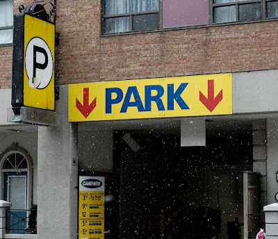
Park (here)


The conventional ‘Park’ signage. Except not really. Well, the ‘P’ in the circle is probably more recognizable as a parking sign and more instantaneous in comprehension that there is parking. I am just waiting for the day that I encounter a ‘Park’ sign that is in a serif font so I can ask ‘Why?’ but this parking sign is understandably in a sans serif because the design does not require a decorative font but rather calls for an efficient font that will allow for a rapid informative purpose. Although I know that this sign indicates that there is parking for cars, I can’t help but wonder about tourists from other countries where the conventions differ. Would they interpret this sign the same way as we do? Or maybe they are more inclined to think that there is an actual park beyond those red arrows. There is no iconic symbol accompanying the words so now it just seems kind of empty to me. Those arrows also kind of irk me because I keep thinking that the parking is ‘downstairs’ although I know it means it’s forward.

~Teri Yeung

The 'Chinese Restaurant'


Yet another bit of typography that I discovered and pondered while at work. Naturally I encounter numerous examples of bad typography while at work seeing as I work in Chinatown but this little bit of typography (once it was explained to me) was so bad it had to be acknowledged and ranted about in some way. When the restaurant first open (a couple of weeks ago) I was thought ‘Hmm…’Chinese Restaurant.’ How unique.’ Note the dripping sarcasm. It didn’t really stand out from the rest of the bad typography in the neighbourhood (notice the use of 3 different fonts not counting the Chinese characters). After a recent conversation, I realized that the words ‘Chinese Restaurant’ wasn’t actually the name of the restaurant but rather the description and the actual name was ‘Grand Treasure’ but it’s shoved into the top right hand corner of the sign. Apparently the typographer decided that underlining it was enough emphasis. I find that this sign must be confusing for both English and Chinese-speaking parties as ‘Grand Treasure’ is in Chinese to the left but not the words ‘Chinese Restaurant’ so really the venue could be anything (i.e. hair stylist, etc..) whereas those who don’t read Chinese would get confused by the misguided hierarchy. Kudos to bilingual Chinese/English speakers, they will only be slightly confused.

~Teri Yeung

Porking


The above photo was taken with my phone on the corner of Gladstone & Dundas. The location is a butcher shop with a facade entirely made of glass so as to see everything they do. One of the things they sell is pork, but the way in which this is photographed, it wouldn't necessarily have to be a butcher shop at all. The photo is shot so that you can't tell what context the word is in. It is photographed at night which could suggest a few things. Seeing the word "Pork" in neon-script at night could suggest a seedy gathering place for lonely men, or it could be the new nightclub on Queen West with it's ironic sign glowing above the entrance. In any case, I wouldn't usually associate neon signage like this with a butcher shop — I would more likely expect to see a hand made sign, whether it was painted or drawn in chalk on a blackboard.

—Colin


Above: One of the most memorable, and adored pieces of graphic design ever created, courtesy of Milton Glaser.

The piece can be displayed horizontal as it is above, or stacked 2x2 as commonly found on many a white T-shirt. The typeface is a very soft, yet mechanically serifed face, reminiscent of Ink that has bled onto paper after being stroked by a slug from a typewriter. Despite the superficial imperfections that have been built into the piece, upon close inspection, it is very well-kerned, and seems to have taken quite a bit of planning in regards to its composition. The heart that seperates the I from the NY is a contrasting heart, not only by the psychoactive bright red that it is coloured in, but also the round, and perfectly clean edges that are nothing like the typeface that surrounds it.

Just being able to read the design message as "I love New York" reveals just how heavily encoded this symbol really is in North American culture since the reader must recognize the text as an acronym, then translate the heart symbol as "love", and NY as "New York." —I love New York abstracted and simplified in to 3 letters and a symbol. Further associations between the graphic and the place of which it denotes can further be read into the choice of typeface Glaser has chosen to use. Cultural meanings can be dervied from "typewriter" looking faces which allude to paper, papers being pushed in businesses, businesses being related commerce, American Commerce to the Wall Street, or similar associations to papers fresh from typewriters of newsrooms from the NYTimes etc...

—Brian Gerard Elicierto

Socialista


This was one of many political propaganda signs around Cuba. This picture was taken from the tour bus on the way to Havana (out of the tourist area). I thought the black silhouette of arms and weapons was particularly shocking. Although it is very abstract, it only takes a second for your mind to assimilate the black shadows as pro-war. The message is bold and proud, but harsh. The use of red, black, and white contributes greatly to the strength of the message and the simplicity of the overall graphic is powerful. The capital red lettering appears hand-drawn, which is likely because of the economic state of the country. Although the revolution took place nearly 50 years ago, it continues to be a prominent topic in Cuba. I imagine the response this sign would get in America if it were on a billboard in Times Square with the word ‘Socialista’ replaced with ‘Long Live America’. It certainly would be controversial at the least. But, in Cuba where their educational system focuses so strongly on the revolution of 1959, this sign is a positive reminder of their feats.

Wednesday, March 14, 2007

Nuts About Bolts?


Looking through the content of my gf's basement/laundry room area, I'll find tons of old goodies lying around. It's a great place for me to peek around for some type. I found this old tool box, and since we have all just dealt with this whole type as image deal, i thought this piece would be an excellent subject. Though it in no way tries to imitate specific tool forms or symbolic references, i get the feeling of tools, calculation and related subject matter through its subtle characteristics. It doesn't feel like just another modern typeface. Through perspective, dimension and layout the type seems to feel authentic and one with the content of this toolbox, a visual harmony that seems a bit different then most toolbox labels. There seems to be that element of playfull attitude that lets it stand out in comparison, yet it still feels precise.

I dunno, i think I've gone mad... maybe I'll start to seeing new things in helvetica!? ( bad joke..who knows)

- Phil

Wednesday, March 7, 2007

Exit Sign


This is the standard exit sign used at the resort I stayed at in Cuba over reading week. I giggled a little when I first saw it because of how contradictory it is to our own. Our exit sign uses red lettering to insinuate caution and in the event of a fire we are taught from grade school to remain calm and walk in single file out of the building. This exit sign however, sends a visual message of "run like hell". Using the colour green, a colour with the obvious connotation 'GO' and the image of the figure running out the door doesn't exactly set a calm mood in the event of an emergency. I also giggled a little at the little shadow off the figure's foot. The image is abstracted to minimal detail, but then there's a shadow added in, perhaps so you don't think he's jumping out a window. Further, the "run like hell" idea is enforced by numerous postings of a shortened version of the sign, with just the person figure and no text. They could have gone the other way and used just text on these signs with an arrow, but clearly they really want people to follow the example of the running graphic figure.

Tuesday, March 6, 2007

Mountain Lion Taxidermy Studio


I recently bought my girlfriend a pair of mounted deer antlers for her birthday. Looking through the phonebook for antique stores, I remembered this studio on Broadview Ave. north of the Danforth which is the neighbourhood I grew up in. This polaroid was taken a few summers ago on what looks like a sunny day. The sign is made up of wooden letters painted white mounted on a wooden board painted black. The look to me is a mix between rural and urban. The modern, simple letterforms are neutral enough to be applied to a number of other business, but the context that they're in and the application of the letters feels somewhat primitive but intuitive as well. There are visual flaws, as well. It could potentially read "Mountain Taxidermy" "Lion Studio" due to the close proximity of those words, and you get the feeling that the words aren't quite sure whether they are aligned left or centered. The sign, however, also looks very stern and serious. It is definitely NOT playful and gives you a sense that this is a serious business. The colours (or lack there of) support this idea as well. The sign also appears to look quite outdated, but perhaps it is the medium of the polaroid that adds to this.

-Colin

Flip Media


Flip Media is in the business of culture jamming – the act of transforming existing mass media to produce a negative commentary about itself, using the original medium’s communication method. It is a form of public activism which is in opposition to commercialism. Flip Media - the act of flipping mass media on it’s head in an effort to reveal that advertising is little more than propaganda for established interests.

I love that the “p” in “flip” becomes a “d” in media. Smart and effective typography that compliments ideology. The font is simple, unpretentious, clean and friendly (like someone you can trust) - maybe helvetica neue? The colours are horrible - 2 less appealing coulours would be difficult to find, but in combination, they work well – it’s like they cancel out each others repulsiveness.

Angela

Typographic playing cards


Here is a deck of cards with very expressive typographic treatment.
There seems to be a number of different typefaces; a mix of old style vs. ‘modern’ fonts; serif, sans serif, which is consistently used according to the suit of the card. In comparison to a regular deck of cards, which is static and consistent in layout, every card is different using typography to replace illustration (jack, queen and king) and words instead of just symbol and number.

I like how it’s so dynamic using a lot of different design elements; extreme sizing and cropping, a lot of layering, diagonal lines, and creative exchange between numbers and letter (i.e “6 of clovers”). It seems so chaotic, but at the same time it’s easy to identify.

I also like how typography is used in such manner that would go against the practical use of the cards; as you know official cards are very formal and simple in typographic treatment (which is crucial for its purpose), yet the designer has chosen this medium to experiment with type in a dynamic way yet achieving heirarchy and visual ease . Although, these cards probably wouldn’t be suitable for professional play, it can still be practical. Perhaps this kind of type can also be familiarized to the reader. At least cheating would be difficult for the new user.

Sally Kim

Wednesday, February 28, 2007

Tazo Tea


Today, I have officially been working at Starbucks for one year so to mark the day, I have decided to do an entry on the typographic treatment of the tea packaging that we sell in the store. I’ve always been attracted to the design for the Tazo Tea Company because of it’s otherwordly, ancient feel and the romanticized little stories on the side of the box. The typography treatment is very elegant and somehow combines what is hip and modern with romantic antiquity. The logo of the company name ‘TAZO’ is clearly a tailored font where the letterforms are made to resemble religious symbols that cannot be pinned to one country or another on a background that makes the letters appear to be carved into woodcut. The packaging is so well done that while doing research I discovered that companies decided to carry the tea brand without even trying out the tea. I also discovered that the whole romantic history of Tazo tea being found on a ‘tazo stone’ (that their identity design is supposedly based on) and being blended with ingredients found all over the world is as manufactured as the packaging. I find it interesting that usually if something is being advertised then when finding out that what you’re being sold is false in some way, that is a deal breaker and you usually stop buying the product but with Tazo tea, even when presented with the truth, the packaging and type treatment some how convinces you otherwise. Even the company name ‘Tazo’ has an elaborate history and the site claims the word to mean ‘river of life’ that sounds so believable but is in fact completely manufactured. The handwritten script on the tea bags along with the woodcut texture, the symbolic font choice and other ancient motifs that have been infused into the packaging of Tazo Tea creates a convincing identity for the company that persuades clients to believe their truth.

Submitted by: Teri Yeung