Tuesday, April 3, 2007

NO CAMPING


This sign is posted repeatedly outside the church at King and Simcoe. I walk past it many times a week going to and from work and it always brings inquiries to my head. Do people often bring their tents downtown to camp? Has there been a big problemt with this in the past? Yes, it is quite a popular place for the bums the sleep, but why not a simple 'no loitering' sign. 'Camping' is so indirect and a little bit ridiculous. You might as well put up a sign that says 'no icefishing' beside it. Perhaps, with the word camping they are trying to be more polite because camping has postive connotations. But, it's almost tempting to pitch a tent and roast some marshmallows just so they can see how absurd the concept really is. If it is for the purpose of giving a more joyous tune to yet another rule we have to follow, then that idea abolishes itself with the giant 'NO' that can only be read with a strict and forceful tone. 'Camping' looks like its just trying to fit inside the margins. The font appears to be a standard sign font, sans serif, simple and to the point. So, just in case you were wondering, no - you cannot camp there! Give a try at the next block over though. :)

jamop


This sticker has been plastered all over the city. Front St. got it especially bad, where these stickers completely wallpapered multiple public garbage containers, phonebooths, hydro poles, you name it. Naturally, such a bold statement caught my attention. The only information the sticker gives to you is the word 'jamop' with a dove symbol in a target. At first, i thought it was to campaign a band, an anti-peace band actually. The way the dove, a globally recognized symbol of peace, is framed in what looks like a gun target and the fact that the stickers conveyed the idea of vandalism in the way they were posted, gave me a 'kill peace' message. But, i was still unsure of its meaning, so i did what any curious mind would do, i googled it. After viewing the website, www.jamop.com, i found that it is acutally quite an ingenious symbol to represent 'targeting peace' not destroying it as i had first assumed. jamop is an abbreviation for 'just a minute of peace' of 07/07/07 at 11:11pm. This is a worldwide effort to stand up for peace. These stickers are posted in various countries, each country using their flags colours - hence the red and white for canada. The word 'jamop' is created with a very friendly typeface, lowercase letters add to the non-threatening/welcoming message. It's placement is subtle and allows for the image to take hierarchy, while leading you to the word. Now, after many weeks plastered to all things downtown, the stickers have been torn and weathered and even though they were effective in creating awareness, now there is a big mess to be cleaned up that i'm sure will not bring peace to the person who is responsible for scraping them off one by one.

Smelvetica


I come forth with a question!

Does Helvetica express neutrality?


Some say neutrality in type is simply a myth, that type cannot exist without spreading some wave of influence. Does Helvetica's sans-serif form act transparent, conveying the given message without prejudice?


My Take :


Likely not.


Neutrality, Odds-on, doesn't exist. But, Surely we can get damn close to it, and if I were ever to pick a font, I suppose Helvetica would be the choice. Helvetica does pose a common perception, and popularity to a degree of hatred. Do we hate it because it doesn't express any solid bias? It would be rather interesting to know what a neutral font looked like, if such a context could be expressed. It could be apocalyptic. Neutrality in many ways could lead to the decline of prescribed type solutions. Designer freedom (once thought to be vanquished) might return.Who knows!?


Delve into this nonsensical question.

- Phil

Emily Carr @ AGO


I usually come across this big poster that advertises for an Emily Carr exhibition on my way to work and I always sigh over the typographic treatment. It may not be all that innovative or ground breaking but neither is it the usual hideousness that we often are subjected to in various other advertisements. I guess I appreciate it for it’s understated and simple treatment and how the designer relied on the colour selection and fonts to, in a way, describe the exhibit. After years of art history classes, I instantly recognized the name ‘Emily Carr’ as a Canadian artist/painter who often depicted Canadian landscapes and had a long and valuable association with The Group of Seven. The font used for her name is different from the rest of the text, a delicate and almost organic font that I feel reflects her art works that are fluid and natural. The colour schemes of her paintings were similar to those used on the poster. The tracking and the fact that the font is different from the rest of the text allow the viewer to enjoy the display font employed. All the words are in lowercase that emphasizes the rounded letters and relates to the organic shapes in her paintings.

~Teri Yeung


The above is a book cover titled "The Cheese Monkeys: A novel in two semester" written by book designer—Chip Kidd. At closer inspection, some light pencil marks can be seen throughout and around the letterforms suggesting not only an underlying grid structure that holds the typographic elements in place, but also that the letters themselves may have been hand-drawn instead of type-set from an off-the-shelf typeface. This can be further evidenced with the strange linearity of the sans-serif faces that seem to scale disproportionately in height:width ration from the E's for CHEESE versus the E of MONKEYS. The tiny spec of a period at the end of monkeys is also disproportionately smaller than what a period normally would be from an off-the-shelf typeface.

The hand-crafted sans serif against the ornamental script for 'The' and the kraft paper textured background give the book jacket a feeling and previousness of being special, handmade, and non-commercial. The treatment of the cover give the impression of a methodical, yet offbeat feeling which uncoincidentally enough, is directly tied into the elements that are inherent and exist in story of the book itself.

—Brian Gerard Elicierto

Pulp Fiction


This piece is reminiscent of our first project - representing a movie, or a portion of a movie, with typography. Instead of images, the artist animates the text to represent the pacing and action of the scene.

The scrolling of the text at different rates, the varying sizes of the text, and the juxtaposition those various elements gives the audience a good idea of what's happening in the scene of the movie without actually seeing the original images. The close cropping of many of the words, coupled with the speed they spill across the screen communicates the chaos of the scene of the movie, yet the scrong angles of Samuel Jackson's lines show him to be an authority figure in control of his surroundings.

The typeface change part way through is a welcome change to the patterns set up in the first portion of the piece - it makes it more engaging.

Brite-Nite


Quebec Artist/Designer Eric Filion aka vj Nokam showed at the Resistor Gallery on March 24th - you can check out a bit of it at http://www.nokami.com/htm_en/03_8.htm. click on Brite-Nite.

I've never experienced anything quite like this, long sheers were suspended from ceiling to floor while two projectors on either end of the room displayed animated graphics. Because the ceilings and sheers were so high, you became completely immersed in text, patterns and numbers which moved so quickly that you could only catch random words like "CLEAR COMPRESSION" and "CRITICAL PATH" - Naturally, Helvetica was the only logical choice here : )

I think that most people absorb far more information on, say the street, than from this installation, but because the information is total rubbish, our minds are "arrested" in space while we process the novel way in which familiar words, symbols and numbers are being communicated (Making the familiar strange?)

I think that this is a great example of how the method of communication can be intrinsically more commanding than the message itself. Very McCluhan.


Angela

Wednesday, March 28, 2007

sooo cool

http://www.industrial-technology-and-witchcraft.de/movs/roundabout.mov

I Met The Walrus


So I was just wandering around downtown and came across this poster that caught my eye with the big caps, san serif font of a seemingly arbitrary phrase ‘I Met the Walrus.’ I don’t know what it was about this poster that caught my eye, the random phrase that amused me somewhat, the medium, or that it was relatively nicely designed compared to the rest of the posters that were ostentatiously demanding that I go to some event or another. Really, the phrase meant nothing to me but after researching it, I’ve discovered that ‘I Met The Walrus’ is a short animation on an interview that a young Beatles fanatic, Josh Raskin, managed to swing having followed John Lennon to his hotel room during the infamous hotel ‘bed-in.’ I find myself wondering if I’m missing some popular culture information because the title still doesn’t make any sense to me. It must mean something to Beatles fans otherwise there would be more information than just the title of the short animation. How many people would remember this poster long enough for them to get home and look it up? The only logical explanation would be that this phrase is a widely known connection with the Beatles, specifically John Lennon and his stand against war and how the government was trying to keep him out because he was promoting peace, blah blah blah…It’s a modern day connection…like William Hong in relation to American Idol rejects.

~Teri Yeung

Bulthaup


Bulthaup is a modern kitchen cabinet manufacturer located on king west. They are simple beautiful designs and are tailored towards different individuals. Designs are geared towards the needs of a changing society and architecture. The image being displayed is their brand logo glazed on the front entrance doors of their retail store, it is a typeface tailored to meet their brand, a very simple sans serif. The context bulthaup applies to their branding on the front door is very slick and sheik, you are able to see through the panel of glass but the bright white brand controls your eye and really controls the segway into the store.
Photo Sharing and Video Hosting at Photobucket

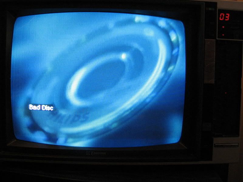
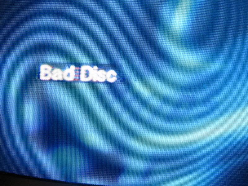
this is what my dvd player tells me when i insert any disc that it cant play... either burned or other wise. i thought it was funny how the description for this is just to tell me that i've used a "bad disc". i thought maybe their could be more information, maybe why its a bad disc.... is it too scratched to play? is it burned or copy written etc.

-sarah-

reflected type


It's interesting when type shows up in unexpected places - reflected onto other surfaces like this image where bits of type are reflected in these funky stools. Sometimes signage is offset from the wall which then casts a shadow - which I know is is common - but it always appeals to me. Maybe it's because it changes depending on the time of day - or whether it's cloudy or not. Type that moves is always more dynamic, and when it does it in an unexpected way (like here) it makes you want to find the source - smart.

Angela

Mmmmmuffins... Please.


mmmmmmufffins...

I look around my usual surroundings at union station. Pass by the same old stuff everyday. However, something seems different this time. Ah ha, it's the muffin place! They must have changed their logo. I though to myself, this kind of works for me. Not to crazy about the wavy coffee-steam "i" symbol, but the "m's" as muffins is kind of sweet. Then i look at all the other cliche and bland logo's around me, and i further realize how somewhat special the existence of this Mmmuffins logotype is. I'm usually not one for logo's that mimmic their product in the type, most appear very kitchy or just don't work out. But for me, this a surprisingly effective solution. There isn't significant change but something about the whole grpahic type thing that makes this a lot less bland. Some of the other chains could get some pointers.

- Phil

Tuesday, March 27, 2007


Saw this LP at a used record store over the weekend and was moved by the photograph. It's an album by French house producers Alex Gopher and Demon and this project is called Wuz. The designer (H5) photoshopped the Wuz logo in order to mimic the rest of the neon signage. I just realized that my last entry featured neon signage. I guess it's just attractive to me, which I think is the whole point of neon. It's main purpose is to attract. Anyways, I was just into the cheeky humour that went into this sleeve, even though it's a little ambiguous, and I admire the skill that went into crafting the faux-neon logo.

-Colin


The above piece was chosen because of the very utilitarian nature and purpose of the signage. Typography stripped down to its bare bones. No serifs, no decoration, just hierarchy of what you see first, resolved only by the relationships in scale and weight contrast between words. The words are set centered on the plane, reading the sign attracts attention immediately to CAUTION, then buried cable, then an explanation of consequences of what tampering can do—entry may result in physical injury. The sign communicates WHAT >WHERE HOW > WHY > WHO in that order precisely just from the visual hierarchy.

The cold, unattractive utilitarian nature of the typography is the effective element that forwarns a person from injuring/killing themselves, and it probably wouldnt be as effective if it were otherwise.


—Brian Gerard Elicierto


I was down on Queen st. and looked up noticed the sign for the first time. Typographically it stood out. It was striking because its above the eye level of all the signs on this busy street and when i noticed it, it almost hit me over the head because it was so so big and informaly stuck up on the wall out of the blue. it doesnt look like a retail sign but a message hovering over everythign else. If it werent for the windows revealing whats inside I would have never thought it was a store. It was just so bold and striking - I like the old type face, as well as the irony it creates "so hip it hurts". it definitely stands out and although in this photo, the colours are faded, i like the gradient of orange/red used against the black background.

Sally Kim